Whitechapel High Street


Project Details
Location: London
Project: Mixed used development
Client: Zikoma Properties Ltd
Consultants:
Planning Consultant: Avalon Planning & Heritage Ltd
Fire Services Engineer: British Fire Advisory Services Ltd
Transport Consultant: Transport Planning Practise Ltd
Construction Managment: Blue Sky Building Ltd
Daylight and Sunlight: Herrington Consulting Ltd
Environment & Sustainability: Carbon Green Consulting Ltd
Land Contamination Assessment: Ashfield Solutions Group Ltd
Visuals: AVR London Ltd
Contract Value: £6m
Project Description
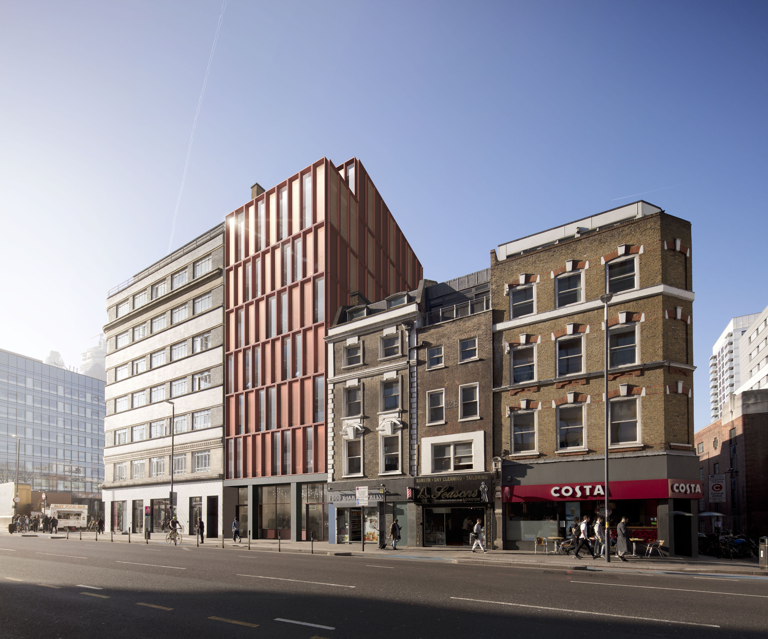
130 Whitechapel high street is an eye catching design for a mixed-use office building in the heart of Aldgate. It will provide 7 storeys of B1 offices above a recessed retail ground floor.
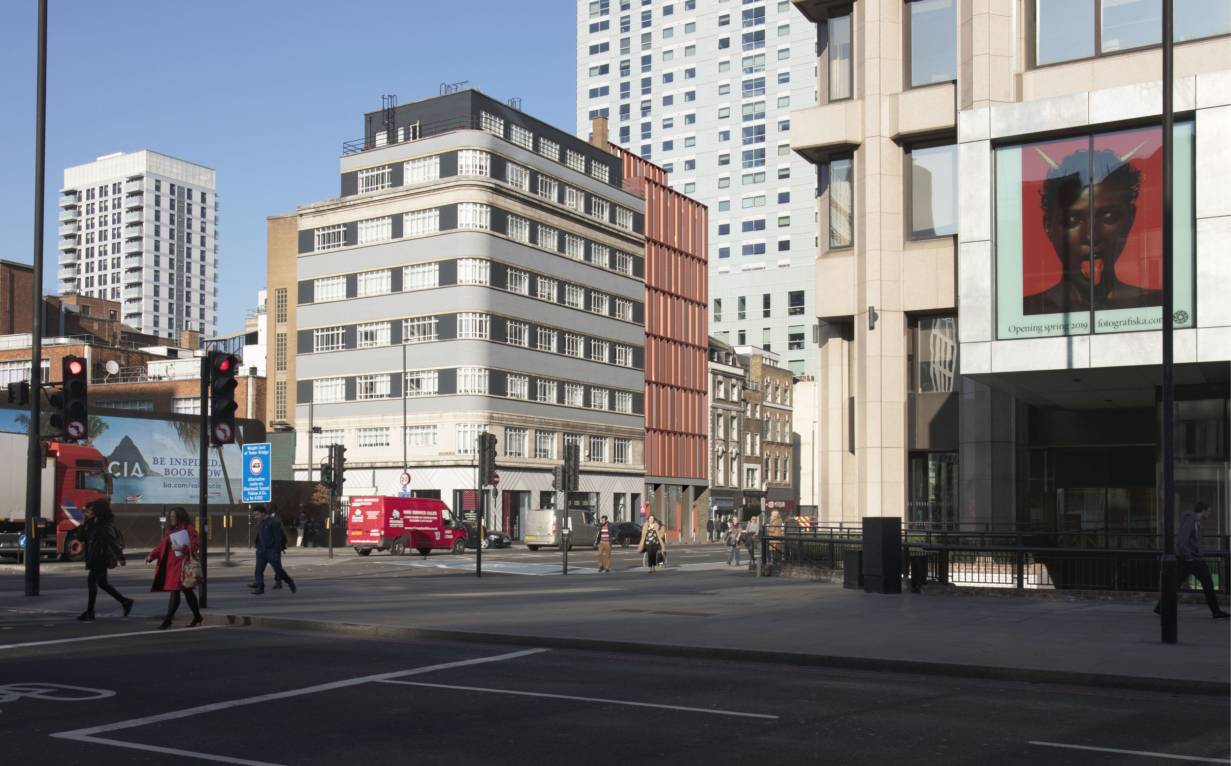
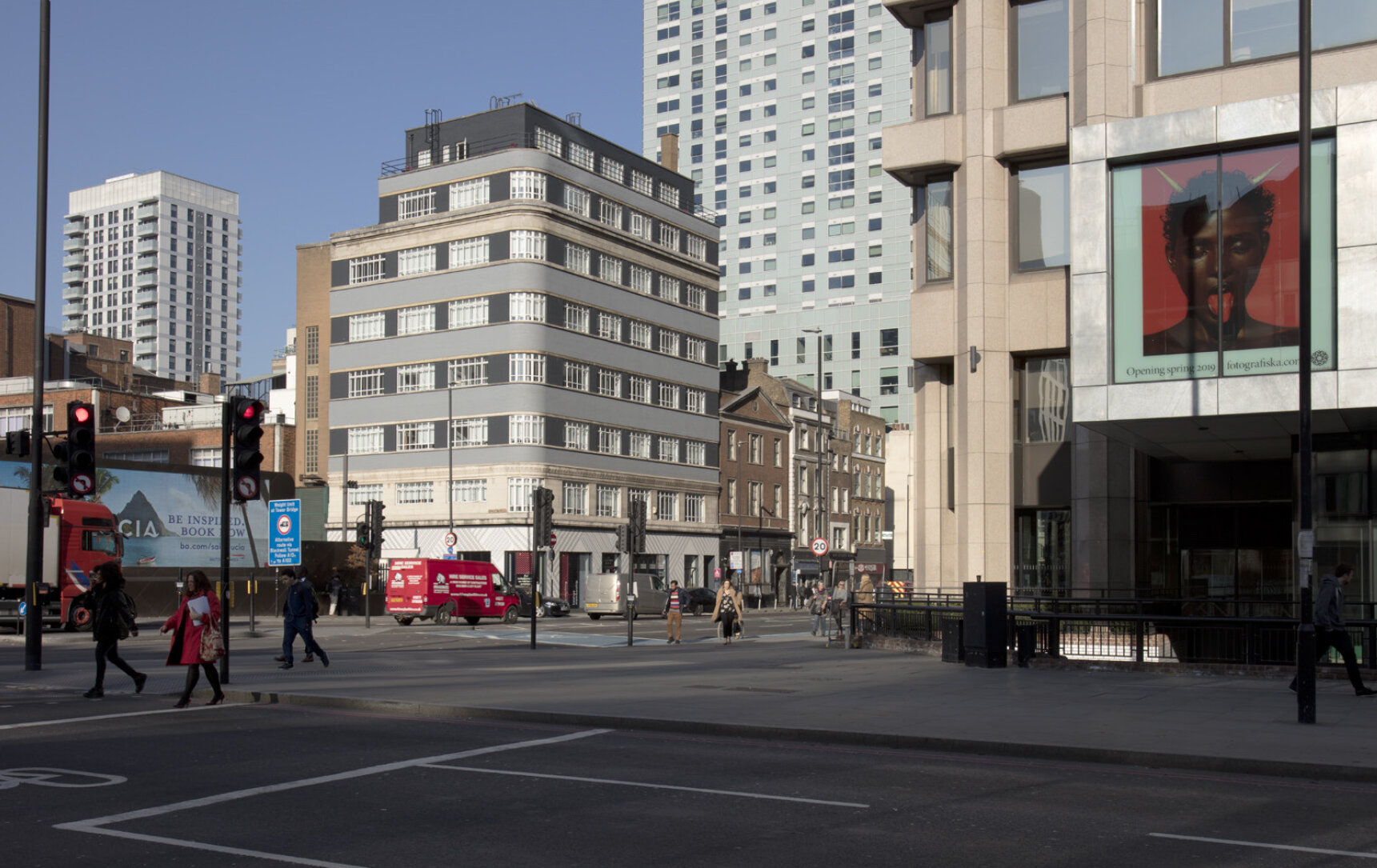
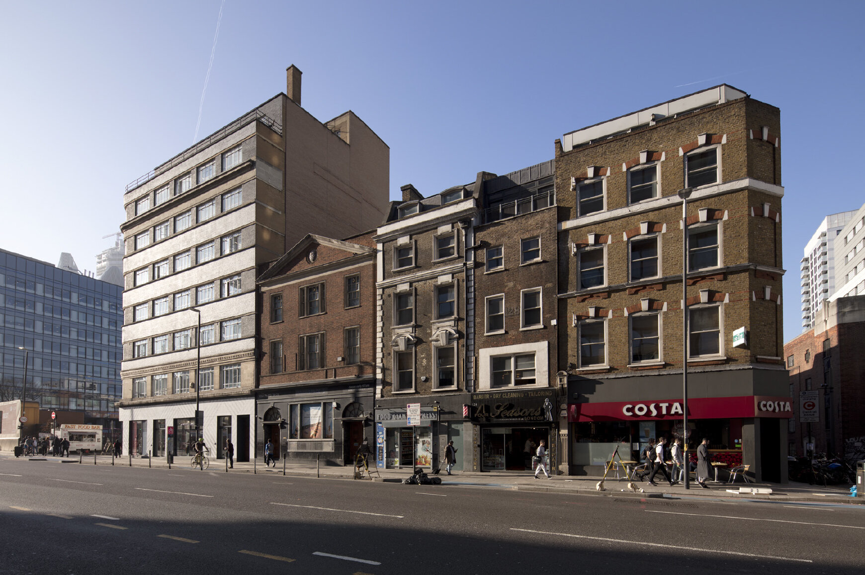
A review of the urban context, local history and design precedent strongly guided the design development to create an original high-quality development that makes a positive and harmonious contribution to the public realm and local area.
At the rear of the building, the massing is stepped back to maintain neighbouring daylight, while also creating valuable external amenity space for the occupiers. The building also provides a welcoming environment to the street with a ground floor setback to address the public realm and street scene.
The façade is formed of Ductal™ concrete frames with brick red aggregate giving the soft brick red colour to the building. The frames generate vertical and horizontal fins to provide solar shading. A pattern of different frame sizes and types creates a woven sculptural façade, animating the building throughout the day with the changing light. Greater vertical emphasis to the upper floors acts as a semi-formal ‘cornice’, while also providing the balcony edges to the external spaces.
An Okalux™ glazing system behind the Ductal panels adds further solar control, materiality and layering by incorporating expanded copper metal mesh within some glass panes. This gives the building a reflective jewel-like quality and adds to the woven theme. An optimal balance of clear glazing and glazed mesh panels within the façade minimises heat gain.
At the base of the building a simple cast concrete colonnade formally accents the main entrances at ground level and provides a welcome to the building.
Working with the site restraints and creating maximum flexibility with a multiple-tenanted office layout is a challenging brief. Continuous communication with the client, as well as a series of productive workshops with the planners and design team, have been integral in the creation of this design.
The final design has created an efficient and imaginative building, with a woven sculptural form that plays with the light, works with its heritage and enhances its context to the benefit of the City Fringe. The building will be elegant and well-mannered with pristine detailing.
It is expected to achieve a BREEAM Excellent rating. Planning Granted, starting onsite 2021
